Nonslop Sidebar
The UX-first sidebar navigation skill for AI coding agents
Design accessible, responsive, and genuinely usable sidebars for SaaS dashboards, web apps, admin panels, internal portals, public websites, and native Apple applications.




npx skills add cybars69/nonslop-sidebar --skill nonslop-sidebarWorks with Codex, Claude Code, Cursor, and other agents that support the open Agent Skills format.
Install · What it solves · How it works · Mobile rules · FAQ · Research
What is Nonslop Sidebar?
Nonslop Sidebar is an open-source sidebar UX skill for AI coding agents. It teaches Codex, Claude Code, Cursor, and compatible agents how to design, audit, and improve sidebar navigation using information architecture, usability, accessibility, responsive behavior, and platform conventions.
Most sidebar guidance starts with component styling. Nonslop Sidebar starts with the questions that determine whether navigation actually works:
- Can people immediately tell where they are?
- Do labels match the user’s language and mental model?
- Are frequent destinations visible without burying everything else?
- Does the hierarchy remain understandable as the product grows?
- Can keyboard, touch, screen-reader, zoom, and right-to-left users navigate it?
- Does the mobile pattern fit an internal application or a public-facing product?
The result is a practical framework for sidebar navigation design—not another collection of attractive but context-free UI rules.
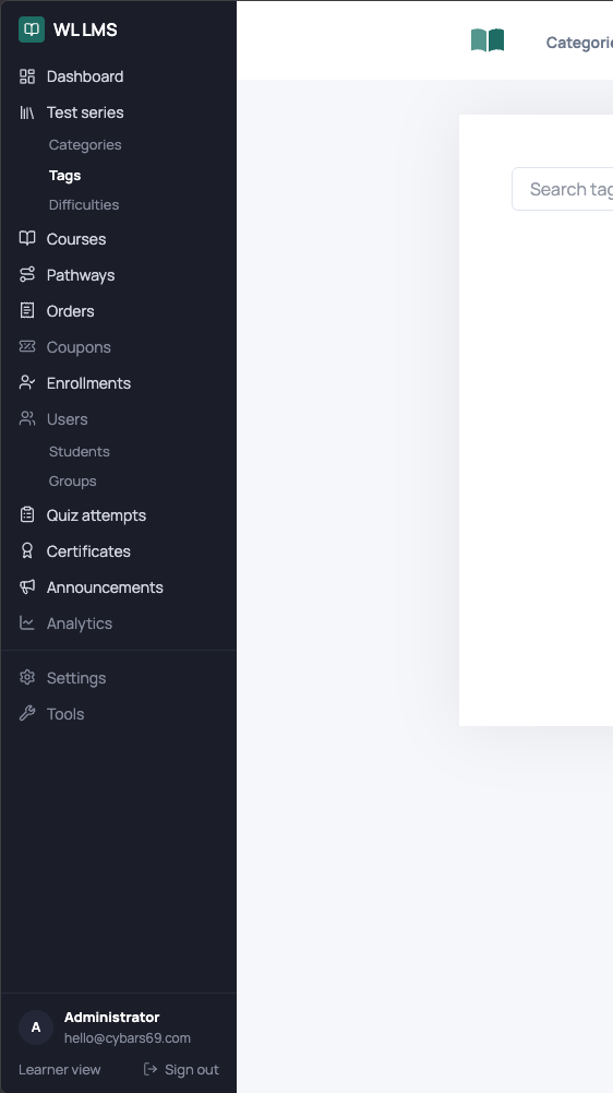
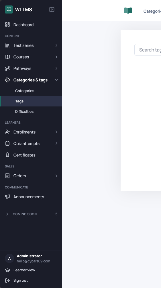
Sidebar UX redesign: from feature list to clear wayfinding
Same product. Same destination. A navigation model users can scan.
A real sidebar redesign shown with matching 30% screen crops.
| 01 · BEFORE | 02 · AFTER |
|---|---|
|
|
|
Flat feature inventory Weak grouping, unclear priority, and unrelated destinations competing at the same level. |
Task-oriented navigation Clear domains, progressive disclosure, stronger orientation, and room for the product to grow. |
What changed: Related destinations became recognizable groups, expandable areas now communicate depth, labels remain visible, the current location is unmistakable, and lower-priority content no longer competes with primary tasks.
Install the sidebar UX skill
Install with npx skills
Install the skill from GitHub using the open Agent Skills CLI:
npx skills add cybars69/nonslop-sidebar --skill nonslop-sidebarInstall it globally for all supported projects and agents:
npx skills add cybars69/nonslop-sidebar --skill nonslop-sidebar -gList the skills detected in the repository before installing:
npx skills add cybars69/nonslop-sidebar --listInstall manually for Codex
git clone https://github.com/cybars69/nonslop-sidebar.git ~/.codex/skills/nonslop-sidebarThe repository root is the skill directory. There is no build step, package dependency, or runtime service.
Invoke the skill
Use $nonslop-sidebar to audit the sidebar navigation in this application.Use $nonslop-sidebar to redesign this internal portal's desktop and mobile navigation.Use $nonslop-sidebar to review this macOS sidebar against Apple platform conventions.What Nonslop Sidebar solves
| Sidebar UX problem | What the skill decides |
|---|---|
| Flat, crowded navigation | Task-based grouping, priority, hierarchy, and disclosure |
| Users cannot tell where they are | Active-location semantics, state design, and orientation |
| Ambiguous icon-only menus | When labels are required and when user-controlled collapse is safe |
| Inconsistent mobile navigation | Product-aware drawer and bottom-navigation behavior |
| Sidebars that break at narrow widths | Content-tested resizing and responsive adaptation |
| Deep, confusing nested menus | A two-level sidebar limit with clearer alternatives for deeper structures |
| Poor keyboard or screen-reader support | Semantics, focus movement, disclosure state, and target requirements |
| Role-specific navigation drift | Conditional destinations inside a stable shared mental model |
| Unclear account or workspace context | Visible context, safe switching, and immediate feedback |
| Visual redesigns that ignore the real problem | Information-architecture review before styling |
How the skill works
Nonslop Sidebar guides an agent through a UX-first sequence:
- Identify the product context. Public website, internal portal, frequently used application, or native platform.
- Confirm that a sidebar fits. A sidebar is useful for broad or growing navigation, but it always consumes content space.
- Map the information architecture. Rank destinations by frequency, importance, evidence, and user mental model.
- Define hierarchy and labels. Prefer specific, keyword-front-loaded labels and no more than two sidebar levels.
- Specify interaction behavior. Active, hover, focus, expanded, collapsed, scrolling, resizing, and role-dependent states.
- Adapt across screen sizes. Preserve access and orientation while choosing the right compact navigation model.
- Validate with realistic tasks. Test real content, localization, keyboard use, zoom, assistive technology, and narrow windows.
Structure first. Orientation always. Styling only when it improves use.
Responsive sidebar and mobile navigation rules
The skill does not rely on one universal breakpoint. Compact behavior begins when the sidebar and the primary task can no longer coexist usefully.
| Product type | Recommended mobile navigation |
|---|---|
| Internal portal or application | Show the 3–5 most important and most frequently used destinations in a persistent bottom bar. Keep the complete navigation in an openable side drawer. |
| Public-facing product | Put the complete navigation in an openable side drawer. Do not add bottom navigation. |
For internal portals, the bottom bar is a prioritized subset of the drawer—not a second competing information architecture. Labels, order, destination identity, and active state remain consistent.
Core sidebar UX principles
- Keep navigation visible on desktop. Do not hide a useful sidebar behind a hamburger merely to make the interface look minimal.
- Treat five to seven primary items as a target, not a law. Broad information architectures may need more specific visible categories.
- Show labels by default. Icons support recognition but should not force users to decode navigation.
- Limit sidebar hierarchy to two levels. Use another pane, browser view, list, or search for deeper structures.
- Place navigation on the leading side. Left for left-to-right interfaces and right for right-to-left interfaces.
- Keep the active destination unmistakable. Visual styling and programmatic semantics must agree.
- Protect critical actions. Do not place the only instance of a critical action at the bottom edge or inside a contextual menu.
- Test widths with real content. Rough web ranges are useful starting points, not universal requirements.
- Respect native platforms. Current platform conventions override generic web heuristics.
- Validate behavior, not preference. Measure findability, task completion, wrong turns, recovery, and orientation.
What is included?
nonslop-sidebar/
├── SKILL.md
├── agents/
│   └── openai.yaml
├── references/
│   ├── audit-checklist.md
│   ├── responsive-and-platform.md
│   ├── sidebar-ux-guidelines.md
│   └── source-map.md
├── CITATION.cff
├── CONTRIBUTING.md
├── LICENSE
└── THIRD_PARTY_NOTICES.md| File | Purpose |
|---|---|
SKILL.md |
Compact entry point, decision order, and reference routing |
sidebar-ux-guidelines.md |
Complete sidebar information-architecture, interaction, accessibility, and validation guidance |
responsive-and-platform.md |
Responsive web, mobile portal, public-product, macOS, iPadOS, and iOS behavior |
audit-checklist.md |
Evidence-based sidebar UX audit and test methods |
source-map.md |
Research provenance and explicit conflict resolutions |
Who should use this skill?
- Product designers working on complex navigation or information architecture
- UX researchers evaluating findability and orientation
- Frontend engineers implementing accessible sidebar components
- Design-system teams documenting navigation behavior
- SaaS, dashboard, CRM, ERP, admin-panel, and internal-tool teams
- AI coding-agent users who want stronger UX reasoning before UI implementation
The skill is framework-agnostic. Its decisions can be applied to React, Next.js, Vue, Svelte, Angular, native Apple apps, or any other interface stack.
Research and UX sources
Nonslop Sidebar synthesizes guidance from:
- Apple Human Interface Guidelines: Sidebars
- Nielsen Norman Group: Left-Side Vertical Navigation on Desktop
- UX Planet: Best UX Practices for Designing a Sidebar
- ALF Design Group: Sidebar Navigation Design
- Mario A. Guzman: Sidebar Guidelines
- UX Planet: Case Study Research—Sidebar Navigation
- daily.dev: Best UX Practices for Designing a Sidebar
The sources do not always agree. references/source-map.md records how conflicting advice about item counts, hierarchy, icon-only collapse, bottom content, width, mobile navigation, and visual prominence was resolved.
Frequently asked questions
What is an AI agent skill?
An AI agent skill is a folder containing a SKILL.md file and optional references, scripts, or assets. The skill gives compatible agents reusable instructions for a specific workflow. Nonslop Sidebar gives agents a repeatable process for sidebar UX design and auditing.
Is Nonslop Sidebar a React sidebar component?
No. Nonslop Sidebar is a framework-agnostic UX skill, not a component library. It helps an agent decide what a sidebar should contain and how it should behave before implementing it in React, Vue, Svelte, Angular, SwiftUI, AppKit, or another stack.
How many items should a sidebar contain?
Five to seven primary items is a useful prioritization target, not a hard maximum. A broad information architecture can expose more top-level categories when specific visible labels improve findability. Less important items should appear lower or inside clearly labeled groups.
Should sidebar icons have text labels?
Yes, in the normal expanded state. Icon-only navigation increases ambiguity and cognitive load. A collapsed icon-only mode is appropriate only as a user-controlled option in a frequently used application, with accessible names, tooltips, and a persistent expand control.
Should a mobile app use a drawer or bottom navigation?
An internal portal should use both: a bottom bar for three to five highest-frequency destinations and a drawer for the full navigation. A public-facing product should use the full drawer without bottom navigation.
Does the skill cover accessibility?
Yes. It covers semantic navigation, links and buttons, current-page state, disclosure state, keyboard traversal, focus movement, touch targets, contrast, zoom, reduced motion, screen readers, localization, and right-to-left layouts.
Does the skill design the visual UI?
Only where UI decisions protect the user experience. The primary focus is information architecture, findability, orientation, behavior, accessibility, and validation—not decorative styling.
Can I use it with Codex, Claude Code, and Cursor?
Yes. The skill follows the open Agent Skills format and contains portable instructions and references. Installation details can differ by agent, but npx skills add supports Codex, Claude Code, Cursor, and many other compatible tools.
Validate the skill
The repository passes the Codex skill structure validator:
python3 ~/.codex/skills/.system/skill-creator/scripts/quick_validate.py .Structural validation confirms packaging and metadata. It does not replace behavioral testing against realistic product requests.
Contributing
Contributions are welcome when they improve navigation decisions, accessibility, platform accuracy, or evidence quality. Read CONTRIBUTING.md before opening an issue or pull request.
Star history
Citation
If this sidebar UX skill supports published research, writing, or a public design system, cite the repository using CITATION.cff.
License
MIT License · Copyright © 2026 cybars69
External articles, platform documentation, product names, and trademarks remain the property of their respective owners. See THIRD_PARTY_NOTICES.md.
Build navigation people understand before they have to think about it.
If Nonslop Sidebar improves your product, consider leaving a ⭐.